Monday, October 29, 2012

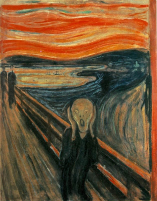
Horror Painting: The Scream by Edvard Munch

Edvard Munch's The Scream (1893)
The Scream by Edvard Munch (Norwegian); 1893; oil, tempura, and pastel on board.
Location: Oslo, Norway; The National Gallery.
        Halloween is right around the corner, so I thought it would be interested to take a look at one of the most recognizable paintings from Art History—The Scream by Edvard Munch (pronounced "monk"). The theme exists in three paintings and one lithograph. Upon first taking this painting in, some people might question its artistic value because it does look like something a child might draw, but that is sort of the beauty of it.

        Allow me to elaborate with some background information you probably didn't know: Edvard Munch, like many now well-known artists, suffered from psychological issues, including anxiety and hallucinations. His paintings usually represent some state of mind or emotion rather than any sort of physically observed reality.

        Munch observed Impressionism (which is a movement in Art History where the subjects of the paintings aren't drawn realistically but they give you the impression of the subject), Post-impressionism (which came after Impressionism and sort of exaggerated its qualities), and symbolism. In addition to using what he saw in these observations, Munch used distortion and color as his forms of expressions—both of which are easily observed in The Scream, his best-known work.

        The painting gives the impression of a figure on a boardwalk, holding its head, with its mouth open—presumably screaming. The figure appears liquid because its spine is curved in an unnatural way, and it is almost skeleton in appearance because its very frail and lacks and hair on its head. In the background of the boardwalk, two more figures appear to be walking away from the main figure.

        Munch has used visible brush strokes, showing directionalities in the lines made, which includes the diagonal of the boardwalk, and the curves of the sky and water—upon which you get the impression of ships. The sky is similar to a sunset in that there are various hues of red, orange, yellow, pink, and blue flowing in horizontal waves, while the water below sort of reflects those colors in the midst of blues, greys, and turquoise colors that swirl and meander.

        Munch described the piece, "I was walking down the road with two friends when the sun set; suddenly, the sky turned as red as blood. I stopped and leaned against the fence, feeling unspeakably tired. Tongues of fire and blood stretched over the bluish black fjord. My friends went on walking, while I lagged behind, shivering with fear. Then I heard the enormous, infinite scream of nature." Having read what the artist had to say about the work, do you feel differently about it? What if I told you the piece set a record for the highest price ever fetched in an auction by a work of art at $120 million (it sold in May 2012)?

        One version of The Scream is in the permanent collection of the National Gallery in Oslo, and another version is currently in a temporary Exhibit at the Museum of Modern Art in New York City.

Monday, October 22, 2012

Fancy French Words: Trompe l'oeil

        Before you choke yourself trying to get the word out on your own, let's say it together: trompe l'oeil. The first syllable sounds like "romp" but with a "t" in front of it; the second syllable sounds like the name "Lloyd" without the "d." Perfect. So this term is French for "deceive the eye," and it refers to the optical illusion where something flat (like a painting) appears to be three dimensional and seems very realistic.

Ceiling of Jesuit Church, Vienna by Andrea Pozzo (Italian); 1703; fresco.
Location: Vienna, Austria; Jesuit Church.
        This image is of the ceiling inside the Jesuit Church in Vienna, Austria. At first glance, it appears to be a finely decorated interior with a dome, but this entire image is actually flat.

        Trompe l'oeil has been used in popular culture, as well, not just in paintings in old churches. A prime example? Raiders of the Lost Ark. That's right, your favorite archaeologist/geeky sex symbol Indiana Jones is associated with the term. In the warehouse scene, the warehouse seems endless not because it was a super big warehouse, but because part of the warehouse was actually painted on glass. The transition from smaller, real warehouse into the extended painting is virtually seamless.

        When a trompe l'oeil is painted on glass, as in this case, it is also referred to as "matte painting." This large a warehouse would be hard to recreate in its entirety and would add to the budget of the film, but having a highly skilled artist paint the optical illusion works out just fine because I'm pretty sure none of you watched the scene and said "obvious tromp l'oeil is obvious."

        Indy isn't the only one getting in on this technique in geeky films, either. Other scenes to make use of the trompe l'oeil effect include the Death Star's laser tunnel in Star Wars, the Starfleet headquarters in Star Trek The Motion Picture, the Batty and Deckard chase scene in Blade Runner, and the OCP tower in RoboCop. Add these movies to your Netflix queue and see if you can tell, now that I've let you in on this movie black magic that got its start in boring ol' Art History.

Warehouse Scene from Raiders of the Lost Ark via Homages, Ripoffs, and Coincidences.

Monday, October 15, 2012

The Art Machine: Andy Warhol's Pop Art

        Andy Warhol's art appears, on the surface, as simple commercial pop art, but when one takes a closer look at the mind behind the art, the viewer is transported into the unconscious. Through screen prints, Warhol was able to act as the machine his work made commentary on, a sort of social industry. His pieces Campbell's Soup Cans and Red Liz (a portrait of Elizabeth Taylor) show iconic images that are deeply embedded in popular culture, seeping their way into fine art.

Campbell's Soup Cans by Andy Warhol (American); 1962; synthetic polymer paint on thirty-two canvases.
Location: New York City, United States; The Museum of Modern Art.

        Warhol takes things commonly seen and without thinking simply reproduces them; he is reproducing the mass produced, every-day object or a person that is often seen in films, on TV, or in photographs. Devoid of personality and emotion, the viewer is left with simply the image.  In a series of canvases, Warhol presents Campbell's Soup cans in a way that takes something every day and ordinary and transforms it into a statement regarding the use of machinery in our lives as consumers.  The easily recognized icon of the soup can in the image series condenses Warhol's message until it is unavoidable.

Red Liz by Andy Warhol (American); 1962; synthetic polymer paint and silkscreen ink on canvas.
Location: San Francisco, United States; San Francisco Museum of Modern Art.
        Similarly, Warhol's portraits of Elizabeth Taylor (he did the portrait thirteen times: Silver, Blue, Orange, Yellow, Chartreuse, etc.), titled Red Liz, takes the actress and presents her as a logo, remarking on the idea of people as commercial property—ways to make money.  It is not photo-realistic, but, rather, it presents Taylor in bold, saturated, and semi-garish yet amazingly refined color combinations (turquoise, red, pink, and black). The act of doing this furthers his agenda that even an ugly painting is still valuable not because of the quality of the art, but because the art depicts some one held in high regard. Warhol essentially compares Elizabeth Taylor to commercial property, like the Campbell's Soup can; she was just turned out by the Hollywood machine.

        Both Campbell's Soup Cans and Red Liz demonstrate how two very different subject matters, a can of soup and an actress, realize America's machine.  Through the use of graphic styles and bold colors, Warhol is able to elevate the every day into fine art through his compositions' colors, patterns and subconscious messages.  Perhaps most importantly is that Warhol's personality and appearance distinguished the man from the image.

Monday, October 8, 2012

The Arnolfini Portrait: Revealing Interest in the Mundane

The Arnolfini Portrait by Jan van Eyck
The Arnolfini Portrait by Jan van Eyck (Netherlandish); 1434; oil on oak panel.
Location: London, England; The National Gallery.
        The Arnolfini Portrait has a few different names, but they are all related. While this name is what it is commonly referred to as, there is no definitive answer to whom this painting actually depicts. It is thought to depict Giovanni di Arrigo Arnolfini and his wife Giovanna Cenami, but it was more recently discovered that this couple did not marry until several years after Jan van Eyck's (the painter) death. Due to this discovery, it has been suggested that this is Arnolfini and an undocumented first wife or that the man is related to Arnolfini, most likely Giovanni di Nicolao (his cousin) and one of his wives. As I mentioned in "Baroque and Caravaggio," not everything in Art History is definitively known.

        Aside from this mystery, this painting gives the impression of being fairly straight-forward. Again, however, the viewer needs to examine the details further to correct the assumption that this painting can be taken at face-value. This painting uses four-point perspective: the best way to explain this is to say you can observe the painting both from above (you look down at the dog, shoes, carpet, etc.) and below (you look up at the chandelier, the gentleman's hat, the bed's canopy, etc.). The woman could be pregnant (she does have one hand on what appears to be a pregnant belly) or this could actually be the latest fashion trend of the time (pregnant celebrities are always en vogue, right?). Further, the woman's hair does confirm that she must be married because it is up and covered; otherwise, an unwed woman's hair would be down.

        Other features of note include things that make this couple appear wealthy (some ideals never change, such as wanting to be seen as wealthy or prominent). This wealth is demonstrated by the rich colors and textures of the couple's clothes, including the man's fur trim and the velvet or similar fabric in the woman's dress. These fabrics are  heavy and most likely for winter, yet the viewer can see a cherry tree blooming outside the window.

        The couple stands before an oriental rug, most likely imported through trade, and the aforementioned chandelier. The couple also boasts a few rarities: oranges (then a delicacy that only the rich could afford) and a fancy mirror. The mirror is convex and actually  utilizes non-Euclidean geometry to show a reflection; upon close examination of it you can see two figures in a doorway, which again cannot be definitively identified. The border around the mirror depicts scenes from the Passion of Christ; the mirror itself is potentially a symbol for the Virgin Mary or the eye of God (seeing the vows of husband and wife).

        The dog could be a symbol of loyalty or simply a wedding gift, further showing the couple's wealth. There is only one candle in the chandelier, which could be a symbol of God or refer to a Flemish (this painting was created in Flanders) wedding tradition; it has also been proposed that this is an unconventional memorial portrait and that the candle signifies that while the husband is alive, the wife has passed (perhaps in labor and thus the pregnant appearance).

        These are but a few of the details you can visit within the seemingly mundane portrait of a husband and his allegedly pregnant wife and this painting is another example of how research relating to Art History can still uncover new facts, causing old theories to be revised and sometimes changed completely. As a last note, after observing this painting in more detail, you might have noticed something above the mirror. In Flemish, the artist has written "Johannes van Eyck was here," and the year 1434.