Monday, November 5, 2012

The Art Machine: Roy Lichtenstein's Pop Art

Today's Geocuration is a quick one because of time constraints, but that doesn't mean it's lacking in interest.
Enjoy.
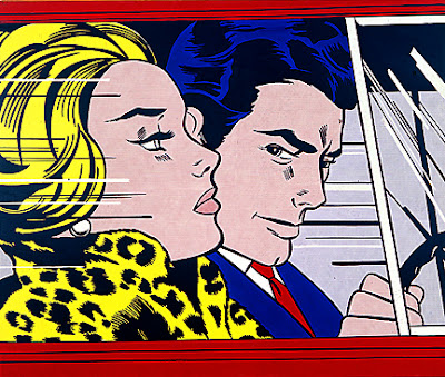
Roy Lichtenstein's In the Car
In the Car by Roy Lichtenstein (American); 1963;  oil and magna.
Location: Edinburgh, Scotland; Scottish National Gallery of Modern Art.

        In my post The Art Machine: Andy Warhol's Pop Art, I talk about the motivation behind Warhol's iconic pop art. Another iconic pop artist that exhibited alongside Warhol was Roy Lichtenstein. While Andy Warhol turned art into a mass-produced non-art art machine, Lichtenstein worked to redefine the definition of art through parody. Chances are you've seen his work without realizing it (or maybe you did?).

        If you look at the paintings' captions, you might notice the media used for these includes "magna." Magna was a brand name of acrylic resin paint that was developed in the late 1940s, and Lichtenstein used it extensively. It's different from traditional acrylic paint because the pigments are ground into acrylic resin by emulsifying them with solvents; it requires using turpentine or mineral spirits to work with because it, unlike traditional acrylic paint, is not water-soluble. Acrylic paint as we know it today was developed in 1960.
Roy Lichtenstein's I know...Brad
I know...Brad by Roy Lichtenstein (American); 1964; oil and magna.
Location: Cologne, Germany; Wallraf-Richartz Museum.

        On the subject of painting media, you might also notice that he places strong emphasis on the primary colors: red, blue, and yellow. Lichtenstein worked off of old comic strips and popular advertising to produce works that are "not 'American' painting but actually industrial painting," a sentiment similar to Warhol's—a relatively unexplored sentiment in the 1960s.

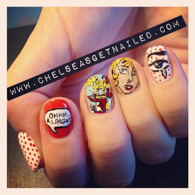
        Not only did Lichtenstein suggest commercialism, but his works remark on the idea of women being homemakers. These ideas live on presently in pop culture—take the Mad Men fad, for instance, and the revival in peplums and other 1950s-1960s fashions. Even the age-old damsel-in-distress is a theme repeated, albeit not originally Lichtenstein's idea; similarly, there has always been a special place in America's (and the world's) heart for thought and speech bubbles. Below you will find a quick look at how pop artist Roy Lichtenstein's work itself is parodied presently, similar to how he himself parodied other art.

Karin Stone's Lichtenstein Girl
M.A.C. Makeup Artist Karin Stone's Lichtenstein Girl
via Adriana de Barros's article, "The Real life Lichtenstein-Comic-Girl"

Chelsea King's Get Nailed - Lichtenstein Nails
Chelsea King's Roy Lichtenstein Nails
via Chelsea King's Get Nailed
Follow Chelsea on Twitter

Monday, October 29, 2012

Horror Painting: The Scream by Edvard Munch

Edvard Munch's The Scream (1893)
The Scream by Edvard Munch (Norwegian); 1893; oil, tempura, and pastel on board.
Location: Oslo, Norway; The National Gallery.
        Halloween is right around the corner, so I thought it would be interested to take a look at one of the most recognizable paintings from Art History—The Scream by Edvard Munch (pronounced "monk"). The theme exists in three paintings and one lithograph. Upon first taking this painting in, some people might question its artistic value because it does look like something a child might draw, but that is sort of the beauty of it.

        Allow me to elaborate with some background information you probably didn't know: Edvard Munch, like many now well-known artists, suffered from psychological issues, including anxiety and hallucinations. His paintings usually represent some state of mind or emotion rather than any sort of physically observed reality.

        Munch observed Impressionism (which is a movement in Art History where the subjects of the paintings aren't drawn realistically but they give you the impression of the subject), Post-impressionism (which came after Impressionism and sort of exaggerated its qualities), and symbolism. In addition to using what he saw in these observations, Munch used distortion and color as his forms of expressions—both of which are easily observed in The Scream, his best-known work.

        The painting gives the impression of a figure on a boardwalk, holding its head, with its mouth open—presumably screaming. The figure appears liquid because its spine is curved in an unnatural way, and it is almost skeleton in appearance because its very frail and lacks and hair on its head. In the background of the boardwalk, two more figures appear to be walking away from the main figure.

        Munch has used visible brush strokes, showing directionalities in the lines made, which includes the diagonal of the boardwalk, and the curves of the sky and water—upon which you get the impression of ships. The sky is similar to a sunset in that there are various hues of red, orange, yellow, pink, and blue flowing in horizontal waves, while the water below sort of reflects those colors in the midst of blues, greys, and turquoise colors that swirl and meander.

        Munch described the piece, "I was walking down the road with two friends when the sun set; suddenly, the sky turned as red as blood. I stopped and leaned against the fence, feeling unspeakably tired. Tongues of fire and blood stretched over the bluish black fjord. My friends went on walking, while I lagged behind, shivering with fear. Then I heard the enormous, infinite scream of nature." Having read what the artist had to say about the work, do you feel differently about it? What if I told you the piece set a record for the highest price ever fetched in an auction by a work of art at $120 million (it sold in May 2012)?

        One version of The Scream is in the permanent collection of the National Gallery in Oslo, and another version is currently in a temporary Exhibit at the Museum of Modern Art in New York City.

Monday, October 22, 2012

Fancy French Words: Trompe l'oeil

        Before you choke yourself trying to get the word out on your own, let's say it together: trompe l'oeil. The first syllable sounds like "romp" but with a "t" in front of it; the second syllable sounds like the name "Lloyd" without the "d." Perfect. So this term is French for "deceive the eye," and it refers to the optical illusion where something flat (like a painting) appears to be three dimensional and seems very realistic.

Ceiling of Jesuit Church, Vienna by Andrea Pozzo (Italian); 1703; fresco.
Location: Vienna, Austria; Jesuit Church.
        This image is of the ceiling inside the Jesuit Church in Vienna, Austria. At first glance, it appears to be a finely decorated interior with a dome, but this entire image is actually flat.

        Trompe l'oeil has been used in popular culture, as well, not just in paintings in old churches. A prime example? Raiders of the Lost Ark. That's right, your favorite archaeologist/geeky sex symbol Indiana Jones is associated with the term. In the warehouse scene, the warehouse seems endless not because it was a super big warehouse, but because part of the warehouse was actually painted on glass. The transition from smaller, real warehouse into the extended painting is virtually seamless.

        When a trompe l'oeil is painted on glass, as in this case, it is also referred to as "matte painting." This large a warehouse would be hard to recreate in its entirety and would add to the budget of the film, but having a highly skilled artist paint the optical illusion works out just fine because I'm pretty sure none of you watched the scene and said "obvious tromp l'oeil is obvious."

        Indy isn't the only one getting in on this technique in geeky films, either. Other scenes to make use of the trompe l'oeil effect include the Death Star's laser tunnel in Star Wars, the Starfleet headquarters in Star Trek The Motion Picture, the Batty and Deckard chase scene in Blade Runner, and the OCP tower in RoboCop. Add these movies to your Netflix queue and see if you can tell, now that I've let you in on this movie black magic that got its start in boring ol' Art History.

Warehouse Scene from Raiders of the Lost Ark via Homages, Ripoffs, and Coincidences.

Monday, October 15, 2012

The Art Machine: Andy Warhol's Pop Art

        Andy Warhol's art appears, on the surface, as simple commercial pop art, but when one takes a closer look at the mind behind the art, the viewer is transported into the unconscious. Through screen prints, Warhol was able to act as the machine his work made commentary on, a sort of social industry. His pieces Campbell's Soup Cans and Red Liz (a portrait of Elizabeth Taylor) show iconic images that are deeply embedded in popular culture, seeping their way into fine art.

Campbell's Soup Cans by Andy Warhol (American); 1962; synthetic polymer paint on thirty-two canvases.
Location: New York City, United States; The Museum of Modern Art.

        Warhol takes things commonly seen and without thinking simply reproduces them; he is reproducing the mass produced, every-day object or a person that is often seen in films, on TV, or in photographs. Devoid of personality and emotion, the viewer is left with simply the image.  In a series of canvases, Warhol presents Campbell's Soup cans in a way that takes something every day and ordinary and transforms it into a statement regarding the use of machinery in our lives as consumers.  The easily recognized icon of the soup can in the image series condenses Warhol's message until it is unavoidable.

Red Liz by Andy Warhol (American); 1962; synthetic polymer paint and silkscreen ink on canvas.
Location: San Francisco, United States; San Francisco Museum of Modern Art.
        Similarly, Warhol's portraits of Elizabeth Taylor (he did the portrait thirteen times: Silver, Blue, Orange, Yellow, Chartreuse, etc.), titled Red Liz, takes the actress and presents her as a logo, remarking on the idea of people as commercial property—ways to make money.  It is not photo-realistic, but, rather, it presents Taylor in bold, saturated, and semi-garish yet amazingly refined color combinations (turquoise, red, pink, and black). The act of doing this furthers his agenda that even an ugly painting is still valuable not because of the quality of the art, but because the art depicts some one held in high regard. Warhol essentially compares Elizabeth Taylor to commercial property, like the Campbell's Soup can; she was just turned out by the Hollywood machine.

        Both Campbell's Soup Cans and Red Liz demonstrate how two very different subject matters, a can of soup and an actress, realize America's machine.  Through the use of graphic styles and bold colors, Warhol is able to elevate the every day into fine art through his compositions' colors, patterns and subconscious messages.  Perhaps most importantly is that Warhol's personality and appearance distinguished the man from the image.

Monday, October 8, 2012

The Arnolfini Portrait: Revealing Interest in the Mundane

The Arnolfini Portrait by Jan van Eyck
The Arnolfini Portrait by Jan van Eyck (Netherlandish); 1434; oil on oak panel.
Location: London, England; The National Gallery.
        The Arnolfini Portrait has a few different names, but they are all related. While this name is what it is commonly referred to as, there is no definitive answer to whom this painting actually depicts. It is thought to depict Giovanni di Arrigo Arnolfini and his wife Giovanna Cenami, but it was more recently discovered that this couple did not marry until several years after Jan van Eyck's (the painter) death. Due to this discovery, it has been suggested that this is Arnolfini and an undocumented first wife or that the man is related to Arnolfini, most likely Giovanni di Nicolao (his cousin) and one of his wives. As I mentioned in "Baroque and Caravaggio," not everything in Art History is definitively known.

        Aside from this mystery, this painting gives the impression of being fairly straight-forward. Again, however, the viewer needs to examine the details further to correct the assumption that this painting can be taken at face-value. This painting uses four-point perspective: the best way to explain this is to say you can observe the painting both from above (you look down at the dog, shoes, carpet, etc.) and below (you look up at the chandelier, the gentleman's hat, the bed's canopy, etc.). The woman could be pregnant (she does have one hand on what appears to be a pregnant belly) or this could actually be the latest fashion trend of the time (pregnant celebrities are always en vogue, right?). Further, the woman's hair does confirm that she must be married because it is up and covered; otherwise, an unwed woman's hair would be down.

        Other features of note include things that make this couple appear wealthy (some ideals never change, such as wanting to be seen as wealthy or prominent). This wealth is demonstrated by the rich colors and textures of the couple's clothes, including the man's fur trim and the velvet or similar fabric in the woman's dress. These fabrics are  heavy and most likely for winter, yet the viewer can see a cherry tree blooming outside the window.

        The couple stands before an oriental rug, most likely imported through trade, and the aforementioned chandelier. The couple also boasts a few rarities: oranges (then a delicacy that only the rich could afford) and a fancy mirror. The mirror is convex and actually  utilizes non-Euclidean geometry to show a reflection; upon close examination of it you can see two figures in a doorway, which again cannot be definitively identified. The border around the mirror depicts scenes from the Passion of Christ; the mirror itself is potentially a symbol for the Virgin Mary or the eye of God (seeing the vows of husband and wife).

        The dog could be a symbol of loyalty or simply a wedding gift, further showing the couple's wealth. There is only one candle in the chandelier, which could be a symbol of God or refer to a Flemish (this painting was created in Flanders) wedding tradition; it has also been proposed that this is an unconventional memorial portrait and that the candle signifies that while the husband is alive, the wife has passed (perhaps in labor and thus the pregnant appearance).

        These are but a few of the details you can visit within the seemingly mundane portrait of a husband and his allegedly pregnant wife and this painting is another example of how research relating to Art History can still uncover new facts, causing old theories to be revised and sometimes changed completely. As a last note, after observing this painting in more detail, you might have noticed something above the mirror. In Flemish, the artist has written "Johannes van Eyck was here," and the year 1434.

Tuesday, September 25, 2012

Readymade Art and Dada: Marcel Duchamp and Hugo Ball


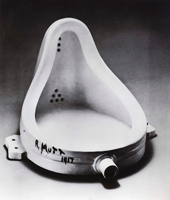
Marcel Duchamp's Fountain
Fountain by Marcel Duchamp (French); 1917; assisted readymade.
Location: London, England; Tate Modern.
Image via Angel Alcalá Brand.
        In the years leading up to World War I (1914-1918), reality was topsy-turvey as Freudian and Marxist thought gained footing, Schoenberg produced atonal “music,” Mallarmé redefine “poem,” Picasso shed human anatomy in Cubist light and Anarchists and Nihilists were making their way into the political scene. “Art” was being attacked from new angles, some absurd, to bring the meaningless of certain aspects of daily life into view and one artist doing so was Marcel Duchamp.

        Duchamp began an artistic revolution, creating readymade art from found objects (also referred to as found object art or objet trouvé).  Duchamp created a piece of ready-made art for an exhibition in 1917 entitled Fountain, which was a urinal he purchased and placed on it's back. He signed “R. Mutt 1917,” but the piece was rejected by the exhibit; Duchamp waged a public protest.


Marcel Duchamp's L.H.O.O.Q.
L.H.O.O.Q. by Marcel Duchamp (French); 1919; assisted readymade.
Location: Paris, France; Musée National d'Art Moderne.
Image via Scott Zagar.
        Duchamp rejected painting, saying paintings were merely aesthetic, that didn't stimulate the mind. Duchamp wanted to question what the notion of art was and rejected all standards set up before him.  One example is L.O.O.H.Q., created in 1919, for which Duchamp took a postcard of Leonardo da Vinci's Mona Lisa. He simply added a mustache and its namesake letters at the bottom.  When the letters are pronounced quickly in French, it sounds like “elle a chaud au cul,” which means “she has a hot ass;” in English,  the letters sound like the word "look." By doing this, Duchamp is expelling the importance of the work to art history, as well as the formalities of the art world in general, and therefore promoting the ideas behind Dadaism—the absurd and meaningless.

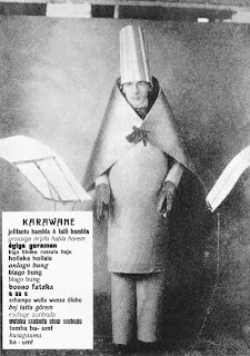
        Hugo Ball was another kind of artist in the Dada movement. An author and poet, Ball felt that because paintings were phasing out human forms it was natural that poetry should reject the use of language.

Hugo Ball reciting the sound poem Karawane
Hugo Ball reciting the sound poem Karawane at
Café Voltaire in Zürich, Switzerland (1916).
Image via Study Blue.
        In 1916, Ball recited his sound poem Karawane on the stage at Café Voltaire in Zürich, Switzerland, where Dada began. Intended to be nonsensical, it reflected the senselessness of the war while politicians felt the war to be a worthy cause. Ball felt that the war didn't reflect Europe's culture, intellect or enlightenment and was, itself, absurd.

       The Dada movement, spread from Zürich to Berlin, New York, Tokyo and elsewhere. The Dada movement was the starting off point for other movements to follow, like surrealism abstract expressionism, performance art, conceptual art, and pop art. As important as Dada was for opening the door to these movements, it died out within a decade.

Monday, September 24, 2012

Baroque and Caravaggio

The Calling of Saint Matthew by Michelangelo Merisi da Caravaggio
The Calling of Saint Matthew by Michelangelo Merisi da Caravaggio (Italian); 1599-1600; oil.
Location: Rome, Italy; San Luigi dei Francesi.

        Baroque is a cultural movement that occurred in many disciplines, including art, architecture, literature, and music. Baroque paintings are characterized by deep, saturated colors and the use of contrasting lighting to create mood. Often depicting people, their emotions are exaggerated, creating a dramatic intensity which is then invoked in the viewer.

        In The Calling of St. Matthew by Michelangelo Merisi da Caravaggio, one can easily see these attributes. First, the viewer can observe the colors. Caravaggio uses dark blacks and browns, and rich golds, teals, and crimsons. Secondly, and perhaps more noticeable, is his use of the light source it the upper-right corner of the image. This light source accomplishes a few things: it creates highlights and shadows, making a high contrast image, which adds to the drama; the light source suggests that there is space beyond the canvas that the viewer cannot see, extending the space represented; and the light source symbolizes the divine, complimenting the subject matter.

        This painting depicts a story from the Gospel of Matthew (Matthew 9:9), where Jesus tells Matthew, a tax collector, to follow him. While there is a consensus among scholars that Jesus is the man standing and pointing, with Saint Peter beside him, scholars debate over which man Matthew is. The confusion stems from the bearded man, whose expression of surprise and hand gesture could mean one of two things: he is asking if he is to follow Jesus or if the younger man at the end of the table is the one requested. Another possible explanation is that Caravaggio actually intended for the painting to be ambiguous as to which man Matthew is.

        If the viewer is to take the Baroque idea of dramatic importance into account, the best answer might be that Matthew is indeed the man at left, with his head down. The reasoning behind this is that the moment depicted is the moment right before Matthew looks up at Jesus, which is equivalent to the moment right before a crescendo in music; this is the moment just before Matthew's entire journey as an apostle of Jesus began, when Matthew was still an ordinary man collecting taxes.

Thursday, September 20, 2012

Face of the Times: Migrant Mother and the Great Depression


Migrant Mother and the Great Depression

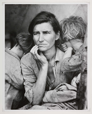
You might have seen this photograph before, especially because of its reuse in recent years in propaganda as America struggled with a lesser recession. Migrant Mother by Dorothea Lange was taken in 1936, in the heart of the Great Depression, and the story behind it is as intriguing as the photograph itself.

Dorothea Lange's Migrant Mother, Nipomo
Migrant Mother, Nipomo by Dorothea Lange (America); 1936; silver gelatin print.
Location: Oakland, CA, United States; Museum of California Oakland.
Dorothea Lange was a hired photographer for the Farm Security Administration (FSA) and Resettlement Administration (RA); her job was to give a face to the consequences of the Great Depression and depict the struggles of normal people.

Lange visited a camp of migrant pea pickers near Nipomo, California, where this photograph was taken. On that day, she took five photographs, including this one of the woman with three of her children in their tent. The image was printed in newspapers nation-wide with the assertion that thousands of agricultural workers in California were starving. As a result, the federal government sent twenty thousand pounds of food to the camp, but by the time it arrived the family shown had moved on to another camp near Watsonville, California.

The woman, Florence Owens Thompson, remained anonymous until the 1970s because Lange merely jotted down "seven hungry children. Father is native Californian. Destitute in pea pickers' camp ... because of failure of the early pea crop. These people had just sold their tires to buy food." According to Florence, however, they never sold the tires off their car because they needed them to migrate with the crops; she thought perhaps Lange had parsed together her story with another family's.

This photograph is considered one of the most famous documentary photographs produced in the 1930s. The photograph became a symbol of strength during hard times and literally gave a face (albeit an anonymous one, for a time) to the Great Depression because of the honesty conveyed.

In 1983, the photograph was once again in newspapers because the Migrant Mother herself had cancer and had a stroke, so her children needed donations to deter the costs of their mother's medical expenses because she lacked insurance. Reports of the amount varied but it was between twenty-five and thirty thousand dollars received. Florence died a few months later, but her story continues through this single moment caught in time.

Wednesday, September 19, 2012

The Importance of the Nude: Vanity and La Grande Odalisque


The Importance of the Nude:
Hans Memling's Vanity and Jean-Auguste-Dominique Ingres's La Grande Odalisque

        Female nudes have been ever-present in art history, but Vanity by Hans Memling and La Grande Odalisque by Jean-Auguste-Dominique Ingres are two examples of how a nude is perceived differently by the subject and the viewer. Both images are of women in private moments, in which they do not see themselves as nude because they are alone, however, when the viewer ventures into the private moment, without the woman's knowledge, she is seen as nude.

Hans Memling's Vanity
Vanity by Hans Memling (German); c. 1485; oil on oak panel.
Location: Strasbourg, France; Musée des Beaux-Arts de Strasbourg.
        In Vanity, the naked woman is depicted with a hand mirror. As the title seems to suggest, the painting demonstrates the vanity of the nude woman. The woman isn't naked when she is alone, but merely existing. The viewer sees her as naked and because she is seen holding a mirror, viewing her reflection, she is also being judged for her vanity. The irony is that she is not nude for her own pleasure, but she's nude for the pleasure of the viewer who is assumed to be male.

        This particular painting touches upon the concepts of the idealized female body and voyeurism. Her hair appears long and flowing, she has small, round breasts, and wide hips, creating a pear-shaped body. Furthermore, she is shown without pubic hair, making her genitalia fully visible to the viewer, and despite her full nudity, she is shown wearing shoes as she stands in a field with three dogs. The setting of the painting leads to creating a voyeuristic feeling so the painting's presumably male viewers can be intrigued by the idea of getting caught with this naked woman outside, creating more thrill for him as he gazes upon her.


Jean-Auguste-Dominique Ingres's La Grande Odalisque
La Grande Odalisque by Jean-Auguste-Dominique Ingres (French); 1814; oil.
Location: Paris, France; Musée du Louvre.


        La Grande Odalisque (meaning The Great Concubine) features a naked woman in a harem who has been exoticized with Turkish-inspired backdrop and accessories. The woman is depicted, similar to Vanity, with small, round breasts, wide hips, and a pear-shaped body. The viewer is immediately drawn in to the fantasy of this exotic beauty, but she remains demure as if she is unaware or does not mind being viewed. Only upon closer examination will one notice her left leg connects in a peculiar way, and that her right breast is not only situated unnaturally close to her arm but would also connect higher on her chest.

        Women are depicted, idealized, and objectified more than men because, traditionally, paintings have always been viewed by males—to please and flatter them. King Charles II of England once commissioned a nude portrait of his mistress Nell Gwyn, which he showed off to other men. The details that men look for in women, these idealizations which have changed over time, have been internalized by women because in earlier times a woman's worth was once based upon her appearance alone. These ideas of the perfect body persist today not just in art, but in media and popular culture. It is not uncommon, in modern times, to see these projections upon women done by women, on themselves and upon other females. The root of this behavior can be seen in piece after piece throughout art history.

Tuesday, September 18, 2012

Picasso's Cubism and Les Demoiselles d'Avignon


Picasso's Cubism and Les Demoiselles d'Avignon

Pablo Picasso's Les Demoiselles d'Avignon
Les Demoiselles d'Avignon by Pablo Picasso (Spanish); 1907; oil.
Location: New York City, United States; The Museum of Modern Art.
        When contemplating Pablo Picasso's painting Les Demoiselles d'Avignon, it is important to consider intent and reception within the historical context of 1907. While nudes have been painted, famously, throughout art history, it has not always been directly acknowledged where the models for such paintings come from. Earlier in art history, it was considered inappropriate for a man, even a painter, to see a nude woman and so male models would be used, resulting in manly women. Originally called The Brothel of Avignon, the title directly acknowledges that the painting depicts not just any nude women, but prostitutes—something the painting's audience seemed to focus entirely on when it premiered. Picasso's other thought was regarding size and how the art world seems to equate size with importance; Demoiselles is a large painting at 243.9x233.7 cm (roughtly 8x7½ feet).

        At the painting's debut, while most onlookers were fixated on the perceived ridiculousness of the work, some observers received Picasso's message about the title. One such person was art critic Gelett Burgess, who wondered where the women came from; Picasso's witty reply to Burgess's something like "where do you think?" The importance of the nude can be seen through movement after movement in art, albeit in different forms. Picasso's form of choice was his cubist style, something akin to a caricature. With a caricature being considered common and every day, it was ironic for Picasso to create this painting so large.  This irony is further played upon by the painting's title and content. Being received as it was proves Picasso's intention, to point out the oxymorons within the art world—proving its own unique ridiculousness.

Monday, September 17, 2012

Literary Connections: German Expressionism

Sally Bowles” by Christopher Isherwood and Kirchner's German Expressionism

        Christopher Isherwood's “Sally Bowles” paints the story of a nineteen year old actress from England living in Berlin in 1930. A cabaret singer hoping to find fame, Sally also makes lovers of older, wealthy men. While Sally did not have a particularly womanly figure, she wore crimson lipstick, heavy eye makeup, eyebrow penciling and powdered her face to compensate. The narrator comments that he sees Sally wearing black most of the time, which blends in with her dark hair; he also remarks on the detail of her green-painted fingernails. If she sounds familiar, it's because Sally also appears in Cabaret.


         Ernst Kirchner belonged to the group of German Expressionists known as Die Brücke (The Bridge). The group focused on expressing concentrated emotion through their use of color, which tended to be unnatural, lending itself to a more abstract feel. In addition to emotion, the group often painted with sexual themes.


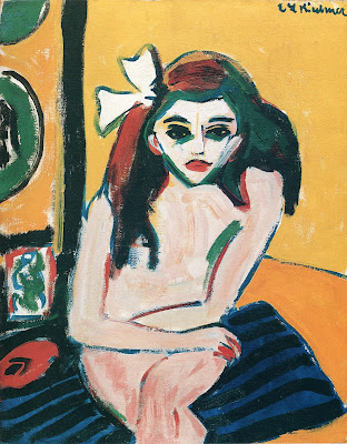
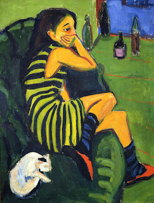
         The ties between this German Expressionist movement and Sally can be seen through both Kirchner and Isherwood's deliberate use of color, and through the sexualization of a young woman, still with a boyish body. In Kirchner's paintings Marzella (1909-10) and Artistin Marcella (1910), a young woman is painted in two different ways.

Ernst Kirchner's Marzella
Marzella by Ernst Kirchner (German); 1909-1910; oil.
Location: Stockholm, Sweden; Moderna Museet.
        In Marzella, the viewer is confronted with a nude young woman, sitting with her arms resting atop her crossed legs. The girl has a white bow in her dark, side-parted hair, dark, well-defined eyebrows, darkly outlined eyes and crimson lips. One can imagine this naked boyish figure to be parallel to Sally, as a sexualized young girl hiding behind her makeup, attempting to appear older. While the girl's skin is a nude, peachy color, it also appears drab with olive and gray tones, effectively removing the force of life from her skin. The girls face, just like Sally's, is lighter than the rest of her body, drawing attention to the girl's dark raccoon-like eyes. The lines of the painting range from horizontal and vertical to diagonal and round, anchoring the painting with a diagonally placed but horizontally-oriented cushion upon which the girl sits; these varying directionalities lend a sense of disorder or anguish, a key emotion in German Expressionism.


Ernst Kirchner's Artistin Marcella
Artistin Marcella by Ernst Kirchner (German); 1910; oil.
Location: Berlin, Germany; Brücke Museum.
        In Kirchner's Artistin Marcella, another young woman is portrayed, but this time in a different way. The girl half-laying on a hunter green sofa has one foot on the floor and the other opposite her body on the cushion, her thighs still in contact. She rests her upper body on one arm, outstretched to the cushion, and the other arm propped across her body on the sofa arm, with her chin in her hand, hiding her mouth. The girl wears a dress striped in two shades of green, blue and black striped socks and red slippers. The walls and floor in the room are green and there are differently colored bottles behind the girl, in a doorway leading to a blue room. A white cat lays curled up next to her on the sofa. Both paintings feature multi-directional lines, but the girl in this painting is not overtly sexualized as before. Instead, the girl appears to be in thought, with a bromidic expression. The girls skin appears dark, but lively and more natural than the previous painting, and the girl wears no obvious makeup.

        In relating both paintings directly to the character of Sally Bowles, it is possible to conceive that the second painting is Sally before she embarks on her journey to reach fame in Berlin, perhaps at her parents' English home, daydreaming. The first painting, more jarring as the girl stares right into the viewer's eyes, could be seen as Sally as the reader knows her—a sexualized girl, attempting to gain a certain lifestyle and wealth through pleasing men—with colors depicting disharmony, having a certain contamination in the tones.  Both girls, much like Sally, seem to be looking for something more than the heartache they are familiar with.